The Challenge
Most beauty platforms today focus solely on transactions — they sell, but don’t connect. I wanted to
design an experience that feels more personal, conversational, and community-driven, where beauty
becomes a dialogue rather than just a purchase.
The Solution
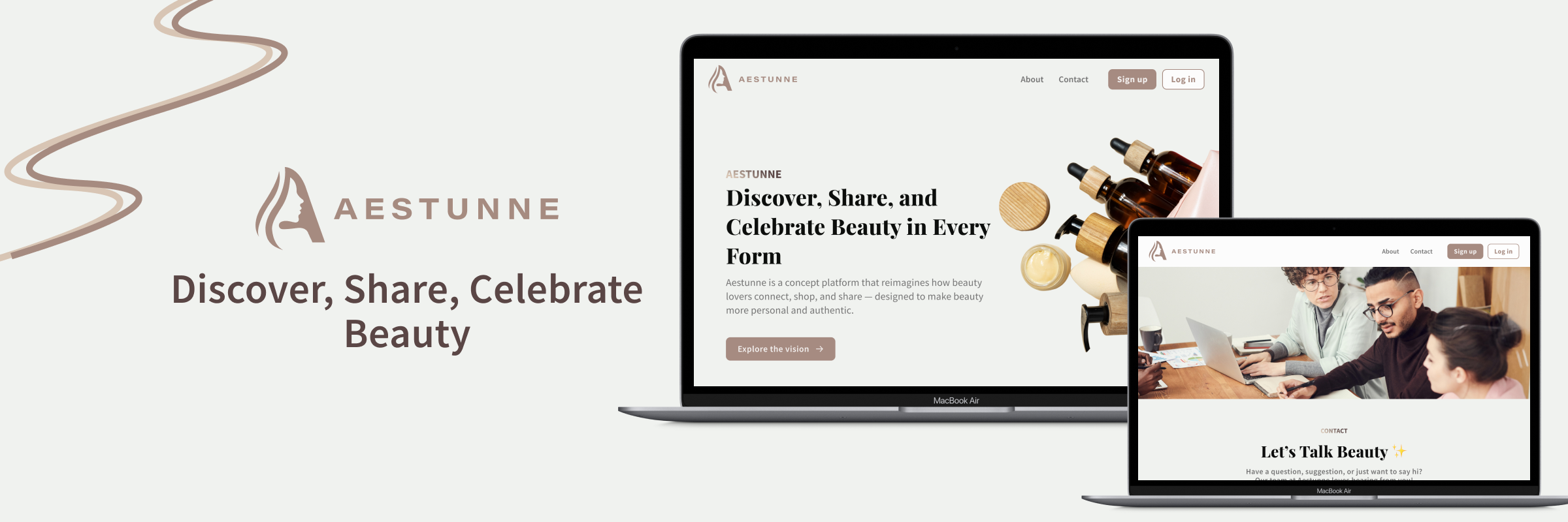
The goal of Aestunne’s design was to introduce a beauty platform that feels modern,
approachable, and community-driven. While the prototype focuses on the landing page,
it captures the essence of what the full experience aims to be — a space where users can
explore beauty products and join meaningful discussions.
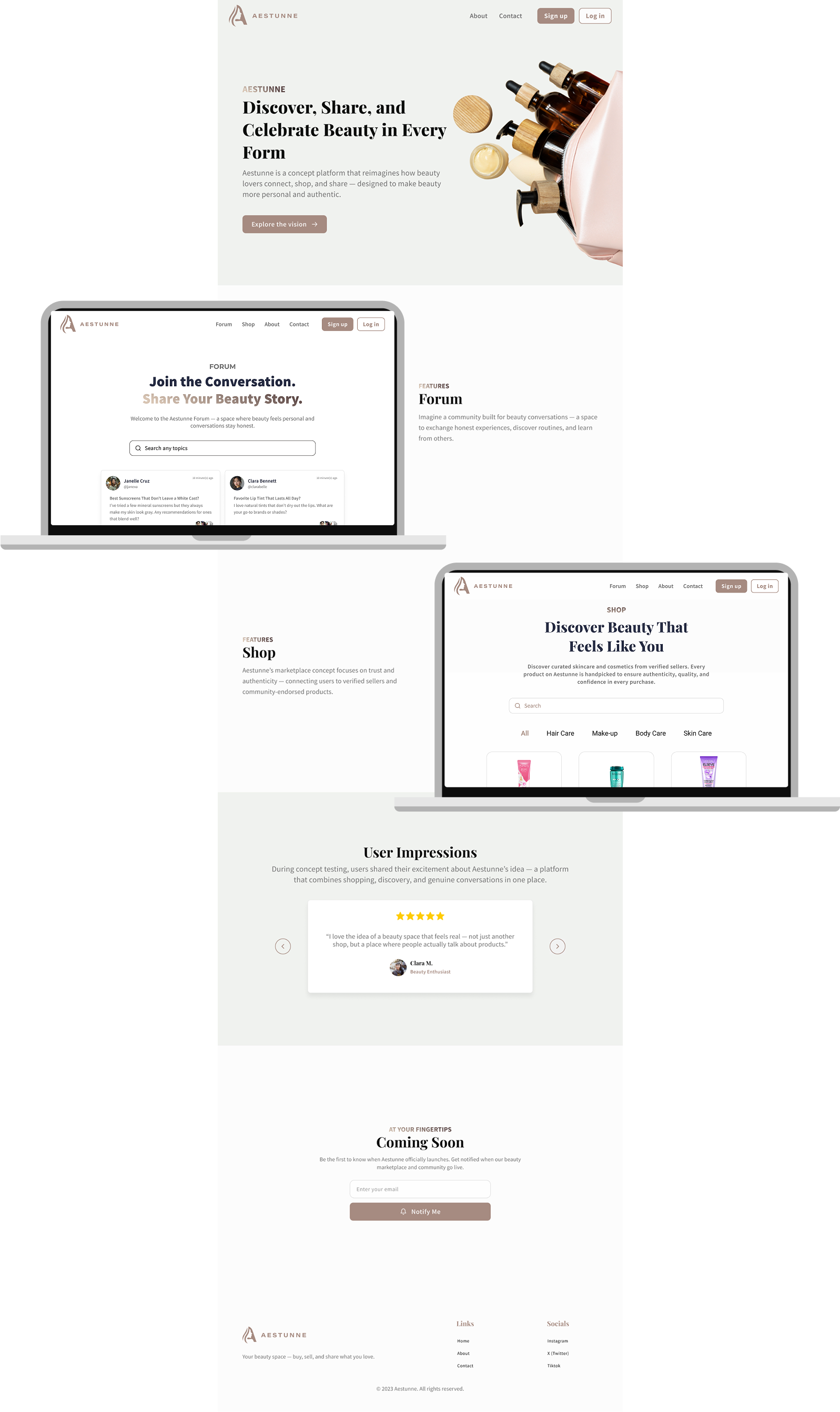
The Shop section was planned as a curated marketplace where users can
explore
and purchase beauty products with confidence. Each product card highlights essential details
and community-driven reviews, creating a balance between commerce and trust. The visual
direction
emphasizes a calm, minimal aesthetic, allowing the products to stand out while maintaining
a luxurious yet approachable tone.
The Forum section was envisioned as the heart of community engagement. It
gives users
a place to start discussions, ask questions, and share their honest opinions about beauty
products and
routines. This section focuses on building connection and authenticity — turning the
platform into a
community rather than just a store.
Design Process
The design process for Aestunne began with defining the brand’s emotional tone — calm,
elegant, and confident. I started by researching beauty and lifestyle websites to understand how
leading brands balanced visual aesthetics with usability. From this, I identified an opportunity for
Aestunne to stand out by emphasizing warmth and community rather than purely commerce.
I then created a moodboard to explore the balance between softness and structure, which
guided the development of the layout and color palette. Wireframes focused on clear hierarchy and
breathing space, while the final high-fidelity designs introduced refined typography and a
harmonious tone throughout. Every section was designed to feel personal yet elevated, reflecting the
beauty industry’s emotional appeal.
Visual Direction
Aestunne’s visual direction embraces warm minimalism — a calm, sophisticated
aesthetic that reflects both beauty and trust. The color palette features a balance between soft
neutrals and deep, earth
- #F0F2F0 and #D9C5B4 bring a clean, airy feeling that evokes
freshness and comfort.
- #A68B81 serves as the brand’s signature tone — elegant, muted, and timeless.
- #594645 and #402F2D anchor the design with depth, ensuring
contrast and a sense of quiet luxury.
Together, these hues create a visual identity that feels gentle, inviting, and refined,
perfectly aligned with Aestunne’s goal of making beauty approachable yet premium.
Typography reinforces this tone: Playfair Display is used for headings, giving the
interface a sense of sophistication and editorial charm, while Source Sans Pro supports body text
with its clean, legible lines. The contrast between serif and sans-serif mirrors Aestunne’s identity
— a brand that values both elegance and accessibility.
The Outcome
The final prototype successfully communicates Aestunne’s brand essence — elegant,
trustworthy, and community-centered. While the project currently highlights the landing page,
conceptual mockups of the Shop and Forum sections demonstrate the envisioned direction of the full
platform.
Through this design, Aestunne establishes a strong foundation for a digital experience
that blends commerce and conversation. The visual language and content strategy set the stage for
future development, ensuring that both new visitors and returning users will feel welcomed,
understood, and inspired to engage.
Learning & Reflections
Through designing Aestunne, I learned the importance of storytelling in digital
interfaces — how color, typography, and space can communicate emotion as effectively as content.
Since this project focused on concept and presentation rather than full functionality, I was
challenged to make the landing page alone convey the brand’s full vision.
This process also strengthened my understanding of scalability in design. The landing
page needed to introduce Aestunne while visually hinting at future features like the shop and forum.
It taught me to think strategically — every visual choice should not only look beautiful but also
support brand growth and user experience.