The Challenge
The existing student portal had an outdated interface and inconsistent navigation
patterns, making it difficult for students to find key academic information efficiently. Users
often struggled with cluttered layouts, unclear icons, and a lack of visual hierarchy that affected the
overall experience.
The Solution
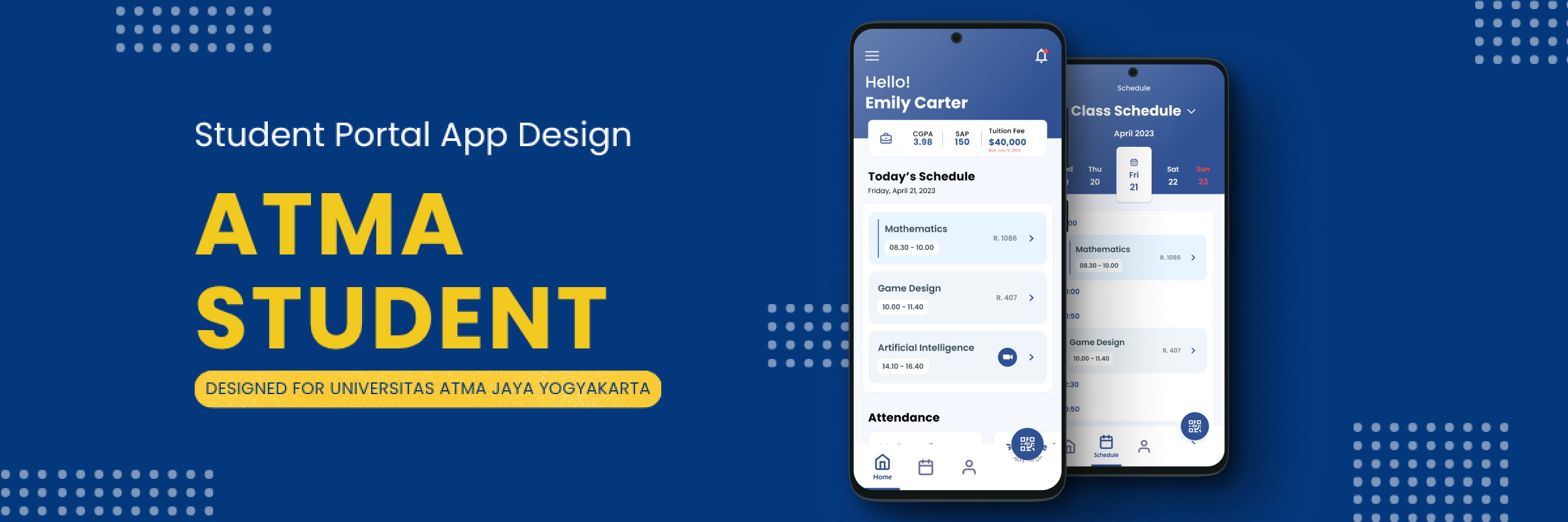
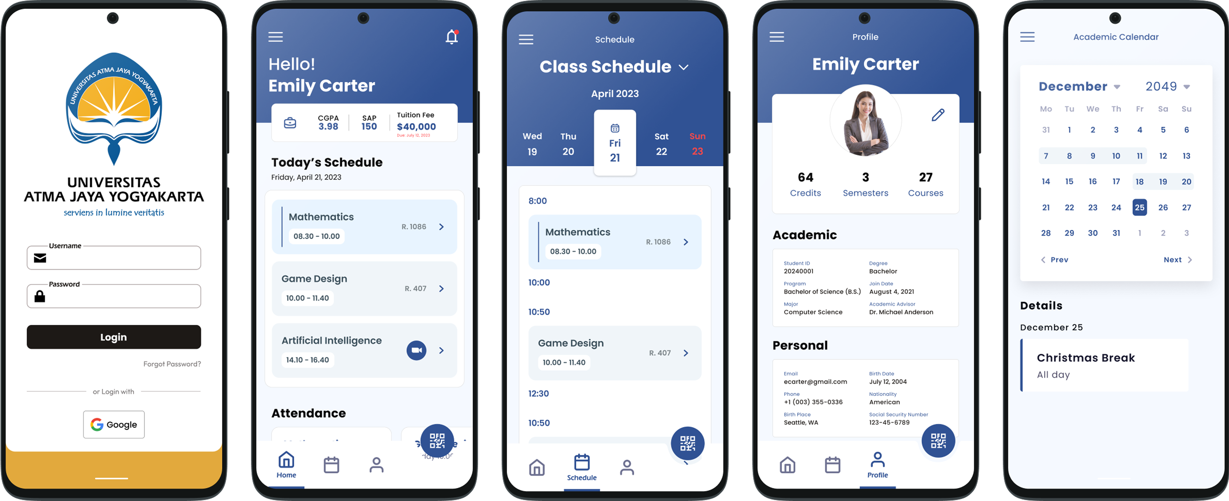
The redesign of Atma Student focused on transforming a cluttered and outdated portal into a
structured, approachable, and efficient platform. The new design redefines how academic
information is presented, prioritizing clarity and logical organization. The interface introduces a
tab-based navigation system that groups related features—such as academic records, class schedules, and
announcements—under clear categories, helping students find information faster with fewer steps.
Visually, the new design embraces a calm and professional look inspired by the
university’s academic identity. Each screen was structured to balance information density with
readability, using consistent spacing, minimal colors, and clearly defined components. The updated
layout emphasizes hierarchy through typography and color contrast, guiding users naturally through their
tasks.
The new experience focuses on predictability and ease of use. Features such
as notifications, online advising, and scholarship information were integrated into a single unified
ecosystem, eliminating the need to navigate through multiple disconnected pages. The end result is a
cleaner, more reliable platform that not only supports academic productivity but also enhances the
overall perception of the university’s digital presence.
Design Process
The process began with a feedback session with one of the students, who
shared frustrations about the old portal’s usability and appearance. To understand the experience
firsthand, I tested the portal myself—and quickly realized how unintuitive and visually outdated it
felt.
From there, I started sketching a simple navigation flow: “Home → Menu → List of features
(Finances, Reports, etc)” to establish a clearer structure. This quick prototype helped me visualize how
students could move through the system more efficiently.
Once the structure felt right, I began building new design in Figma, using the university’s
official colors and fonts as the foundation. Every screen was carefully crafted to ensure information
was easy to scan and balance academic seriousness of energy and pride.
Visual Direction
The visual language draws directly from the university’s colors and symbolism:
- Blue (#305294) represents strength, stability, wisdom, and spiritual depth—echoing “Atma Jaya” which means “The Victorious Soul”.
- Yellow (#E2A93D) conveys excellence, intellect, and moral clarity—aligned with the university’s vision and Christian foundation.
- White adds purity and balance, complementing the boldness of blue and yellow.
This combination creates a strong, high-contrast academic look that feels
dynamic rather than calm—reflecting both discipline and ambition. The Eras BK BT
typeface reinforces a sense of formality while remaining approachable. Together, they establish a bold
identity that feels unmistakably Atma Jaya.
The Outcome
The redesigned Atma Student portal offers a fully modernized experience.
Students can now find what they need easily, with clear navigation and visually organized sections. What
used to be a confusing, outdated system has become a structured, purposeful tool that actually supports
productivity.
Easy element—from the restructured menus to the consistent components—was built to reduce
confusion and enhance clarity. The result is a portal that feels both functional and distinctly
“Atma Jaya”.
Learning & Reflections
This project taught me that redesigning an existing system can be both challenging
and rewarding. By testing the old interface myself and reworking every part of it, I realized
that improving UI, when grounded in logic and identity, can transform how users perceive and interact
with a product—in this case, a student portal.
Rebuilding the entire interface gave me a deeper understanding of how hierarchy, color, and
structure influence user flow. While it was challenging, it provided that even complex redesigns can be
enjoyable when the goal is to make something simpler, clearer, and genuinely helpful
for users.


