The Challenge
Book tracking apps often feel cluttered, overly complex, or lack personalization. I
wanted to create
a minimalist, elegant interface that keeps users focused on what matters — their books — while
offering intuitive features like categorizing books into collections (e.g., Want to
Read, Currently
Reading, Finished). The challenge was to balance simplicity and functionality while maintaining a
warm, tactile design aesthetic that evokes the feeling of a personal library.
The Solution
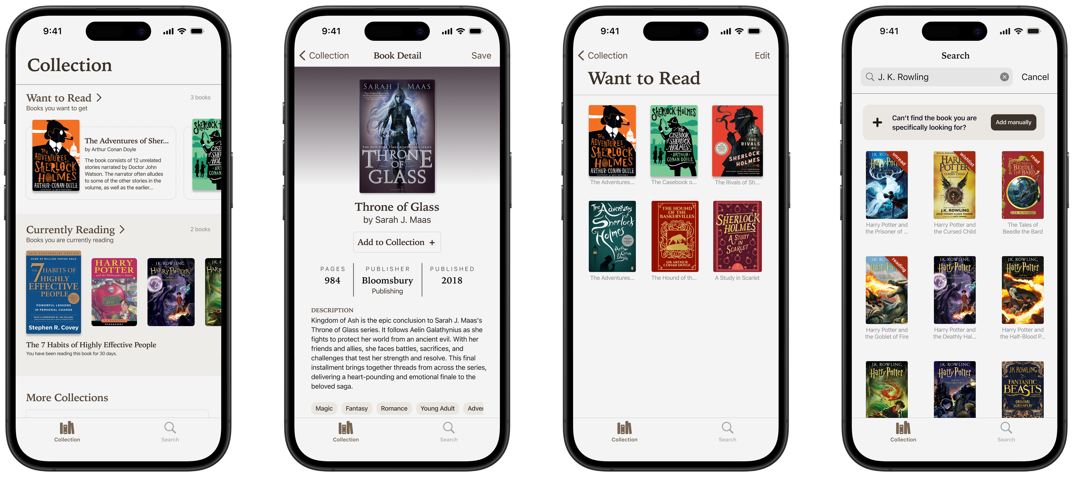
BooJou was built around two main goals: ease of input and clarity of
organization.
Users can:
- Add books automatically by scanning barcodes or manually by
entering details.
- Categorize books into collections such as Want to Read, Currently Reading, and
Finished.
- Track progress and see how long they’ve been reading a book.
- Store all formats (physical or digital) in one unified view.
This system helps readers avoid duplicate purchases, remember what they’ve borrowed or
lent, and make informed choices about their next book.
Design Process
1. Research & Synthesis.
I began by conducting qualitative interviews and desk research to understand readers’
behaviors, motivations, and frustrations. The goal was to uncover how readers currently discover,
track, and manage their books — and where friction occurs.
Key questions included:
- Where do people keep their book collections?
- How do they decide what to read next?
- What tools or platforms do they use to manage books?
- What challenges disrupt their reading experience?
From my synthesis, several insights emerged:
- Scattered Tools and Workflows — Readers rely on multiple apps, screenshots, and
notes, resulting in disorganization and lost information.
- Forgetting Past Reads — Many forget which books they’ve finished or own,
sometimes buying duplicates.
- Decision Fatigue — Users struggle to decide what to read next, especially after
finishing a book they loved.
- Preference for Simplicity — They wanted a calm, uncluttered space — not another
social platform.
- Desire for Continuity — Readers wished to see their progress and manage both
digital and physical collections together.
To visualize this, I mapped the user journey — from searching for a
book, purchasing or
borrowing it, to tracking and completing it. This map revealed recurring friction points like lack
of centralized organization, scattered tools, and unclear book progress tracking.
From this, the key design opportunity emerged:
“
Help readers track and organize their books across all formats and collections — in a simple,
unified experience.
”
2. Ideation & Information Architecture
We brainstormed feature ideas that directly addressed the identified pain points —
focusing on simplicity and personal value.
Our main concepts included:
- Seamless manual input and barcode scanning for quick book entry.
- Clear collection-based organization for different reading stages.
- A minimal dashboard that prioritizes personal reading goals and status.
Wireframes and flow diagrams were developed to define a clear navigation structure and
reduce user cognitive load.
3. Wireframing & Prototyping
Initial wireframes prioritized readability and structure. We tested multiple
layouts for the book list and detail screens, iterating to ensure hierarchy clarity and visual
balance. User testing revealed that readers preferred larger book covers for recognition, minimal
button clutter, and intuitive input fields.
Visual Direction
BooJou’s visual direction was inspired by the warmth and calm of reading — a design
language that feels both literary and modern. The goal was to evoke the experience
of sitting in a
cozy reading nook: peaceful, structured, and personal.
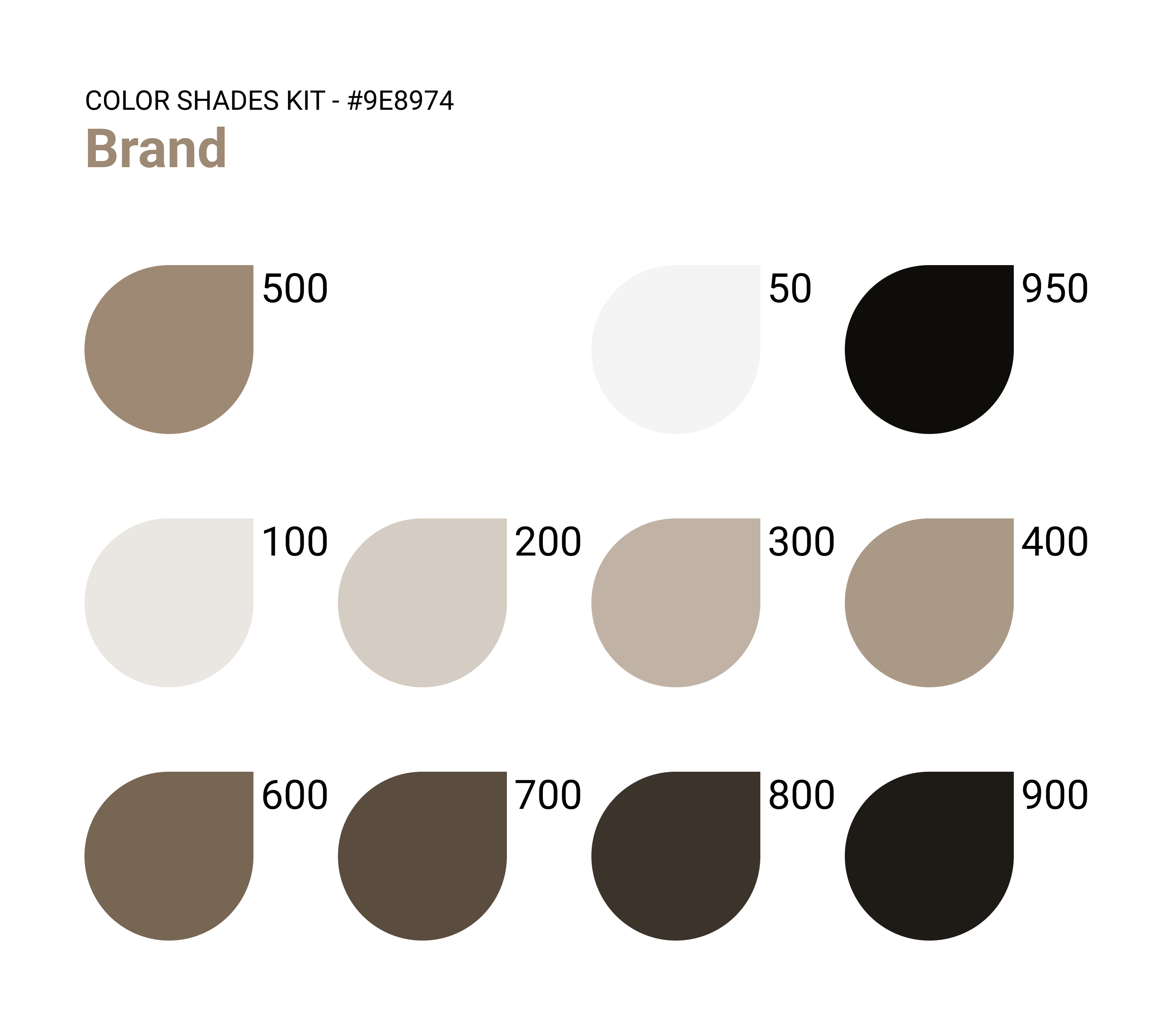
Color Palette
The primary palette centers around a warm, muted brown tone
(#9E8974) with a
full range of complementary shades from soft beige to deep espresso. These colors mirror the
texture of aged paper, wooden shelves, and natural light, creating a
soothing environment
that encourages focus.
Typography
- Iowan Old Style — used for titles and headings to give a refined,
classic editorial feel reminiscent of printed literature.
- SF Pro — used for body text for its clarity and modern neutrality,
ensuring high readability across interfaces.
- SF Pro (Wide Spacing) — applied in certain labels and secondary texts
to add contrast and elegance, giving the layout a lighter and airier rhythm.
UI Style
- Rounded corners, soft shadows, and generous white space emphasize comfort and tactility.
- Subtle dividers and thin strokes reflect the minimal, book-like precision of printed pages.
- Book covers are intentionally highlighted to bring vibrancy within the neutral setting — letting
users’ collections visually stand out.
Overall, BooJou’s visual system bridges digital structure and
bookish warmth, creating
an experience that feels calm, personal, and timeless.
The Outcome
BooJou delivers an organized, personal, and distraction-free way
to manage reading
habits.
- Barcode scanning and manual entry simplify book input.
- Unified tracking bridges physical and digital books.
- Visually cohesive design invites focus and calm.
By centering on readability and simplicity, BooJou transforms the act of tracking books
into something intentional and enjoyable.
Learning & Reflections
Designing BooJou deepened my understanding of how research-driven
insights shape both
product flow and emotional tone. I learned to translate qualitative findings into a digital
experience that feels human and personal — balancing functionality with warmth. This project also
reinforced the importance of empathic design, where small, thoughtful interactions
can make everyday
experiences — like tracking books — more meaningful.