The Challenge
Many existing productivity timers only focus on tracking time, neglecting the emotional and
environmental factors that affect focus and well-being. Users often struggle to maintain
consistent productivity habits due to rigid timer setups, lack of flexibility, and uninspiring
interfaces. The challenge was to design a timer that feels personal, calming, and supportive
of users’ natural rhythms—rather than demanding or mechanical.
The Solution
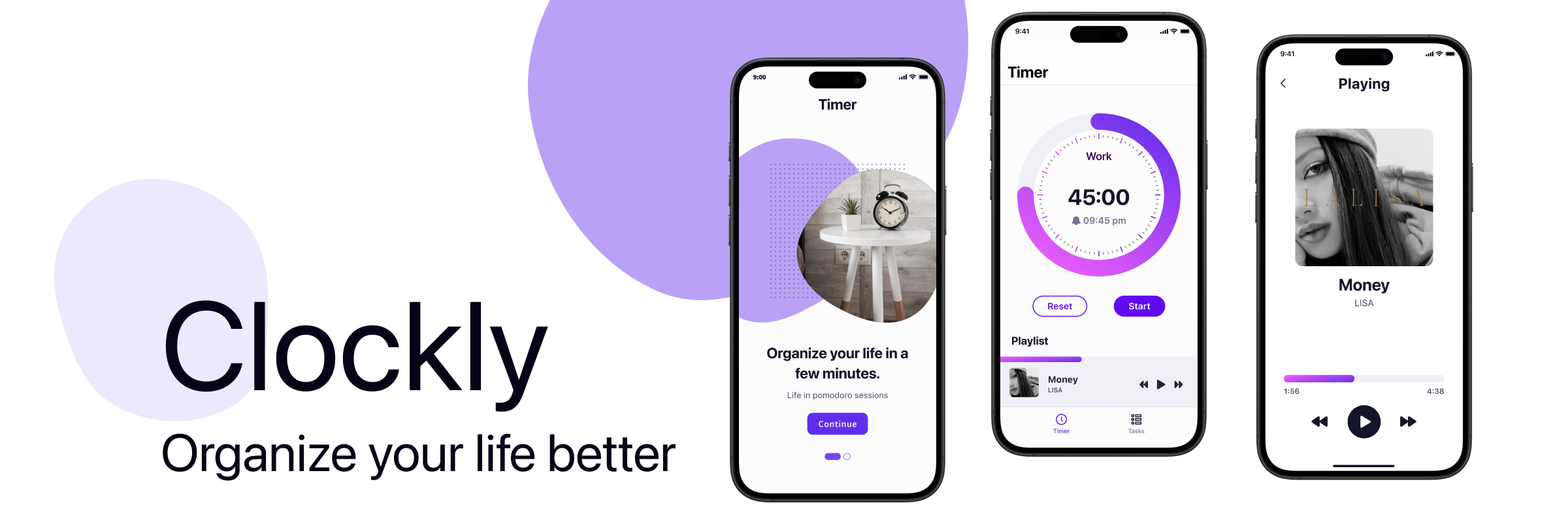
The Clockly design focuses on balancing functionality with simplicity. It
allows users to:
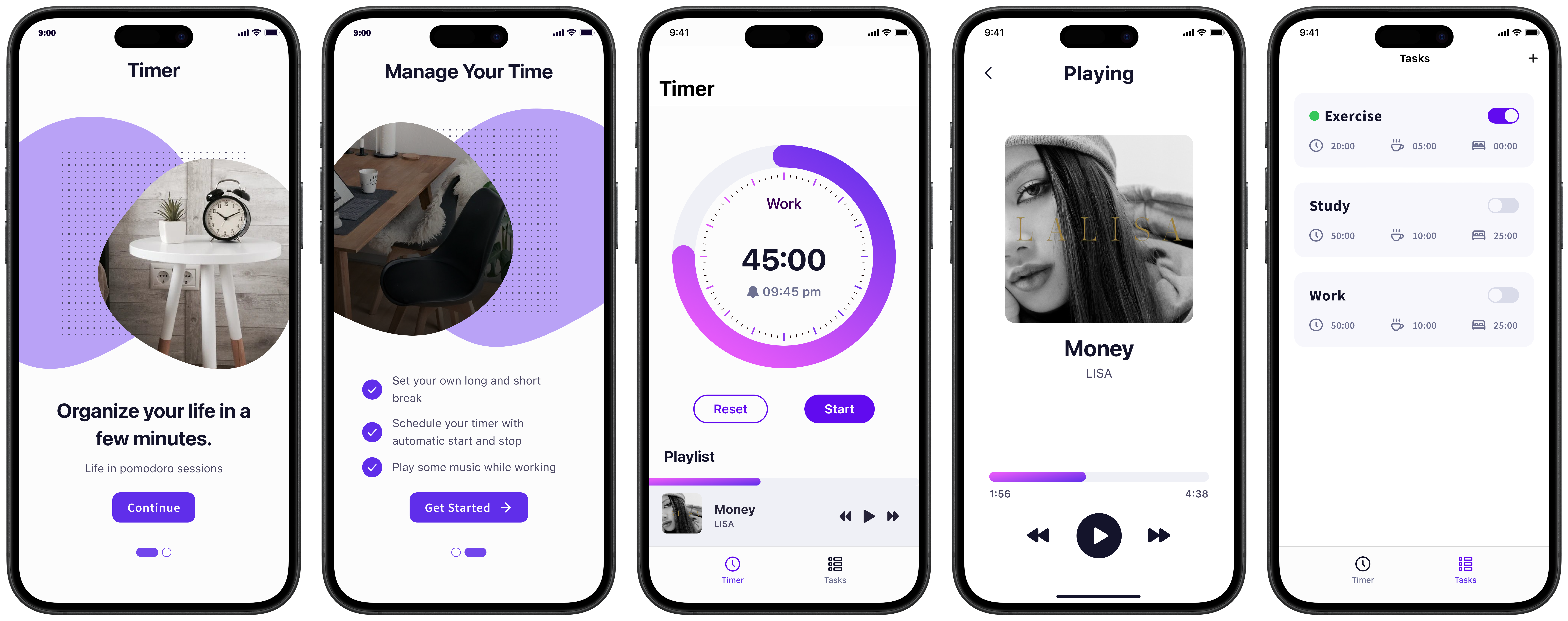
- Set personalized work, short break, and long break durations
- Auto-start and stop sessions based on schedules
- Play music during sessions to maintain focus
The core idea was to create an app that feels effortless to use while providing advanced
timer controls for serious productivity users. Each screen was designed to minimize distractions
and help users stay in flow.
Clockly introduces a holistic approach to productivity by combining customizable
timers with mood-enhancing features such as background music and smart automation. Users can
create personalized focus sessions, set short or long breaks, and let the app automatically transition
between sessions for an uninterrupted workflow.
The interface emphasizes clarity and simplicity—every action, from creating a new task to
managing session settings, feels smooth and natural. Visual balance, soft color contrasts, and minimal
distractions allow users to stay in flow, while gentle accent colors add a touch of motivation and
calmness.
Design Process
The design process began by identifying the core features—timer controls, session
scheduling, and background music—to establish a clear direction and ensure each function
complemented the goal of maintaining focus and balance. However, during development, the programmers
became heavily focused on implementing the first core feature, which caused other planned
functionalities to be delayed or overlooked.
This created an imbalance between the design and development progress. To
adapt, I refined the UI around the features that were actively being built while ensuring that future
functionalities could still be integrated seamlessly. Maintaining close communication and flexibility
was essential; I focused on creating a consistent design structure so that the unfinished elements could
naturally fit into the system once development caught up.
The Add Task screen reflects this adaptable structure—allowing users to customize focus
sessions with adjustable durations, break intervals, and optional long breaks, all within a clean and
intuitive layout. Similarly, the Playing screen integrates background music to enhance focus, combining
minimal visuals, large album artwork, and purple gradients to evoke calmness and motivation.
Despite some planned components being postponed, the workflow remained efficient, and the
overall design retained coherence and purpose throughout the process.
Visual Direction
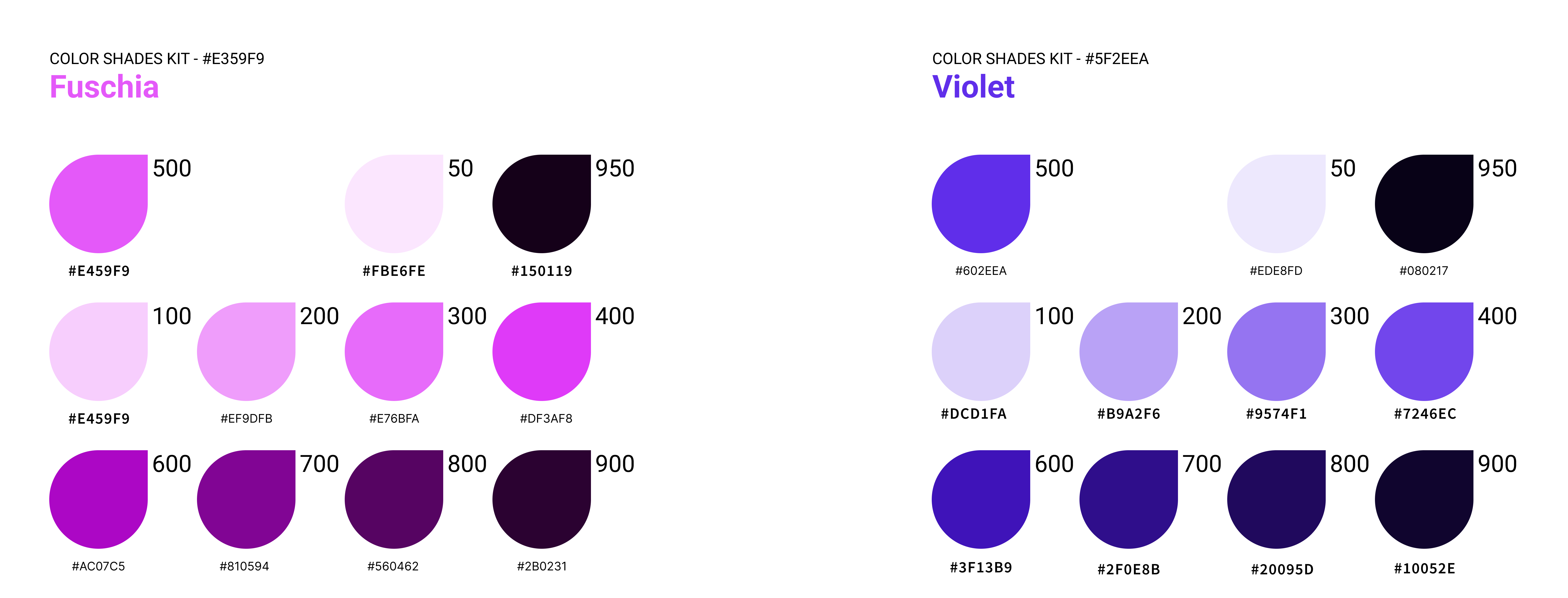
Clockly’s visual direction is defined by its energetic yet calming purple palette, combining
#E359F9 and #5F2EEA as its primary colors. These two shades are used
both as solid accents and in gradient form to convey focus, energy,
and flow. The gradient—transitioning from the lighter magenta to the deeper violet—symbolizes the user’s
rhythm between intense work and relaxing breaks.
Typography uses SF Pro for its clean and modern tone, ensuring legibility
and harmony with iOS design standards. The layout follows a spacious and minimal structure, allowing
each interaction to feel fluid and visually balanced. Subtle shadows and rounded components give the
interface warmth and approachability.
Together, these visual elements create a look that’s both productive and serene—motivating
users without overwhelming them.
The Outcome
Clockly delivers a streamlined and enjoyable timer experience designed for deep work and
mindful breaks.
Key implemented features include:
- Customizable focus, short break, and long break durations
- Automatic start and stop between sessions
- Integrated music playback for enhanced focus
- Minimalist interface optimized for quick interaction and clarity
The final design balances function and simplicity—allowing users to stay in control without
visual clutter. The color palette and typography contribute to a motivational yet soothing environment,
helping users stay consistent in their productivity cycles.
Overall, Clockly successfully achieves its goal as a personal productivity companion—clear,
intuitive, and pleasant to use. Even with development constraints, the design remained cohesive,
achieving a prototype that embodies focus, calmness, and ease.
Learning & Reflections
Clockly reinforced how crucial collaboration and pacing are in a real production
environment. A well-defined feature list is only the start—maintaining balance between design
and development timelines is just as important.
I learned to stay adaptable when priorities shifted and to communicate clearly about which
features needed attention next. The experience also taught me that a good designer doesn’t just react to
what’s built—they help guide the process toward what users truly need, even when plans
change.
Working on Clockly highlighted the importance of flexibility and communication between
teams. Balancing design vision with technical progress required iteration and empathy for the
development process. It also deepened my understanding of how consistent structures and scalable UI
systems can preserve design integrity under changing priorities.
In the end, Clockly became not only a focused timer app but also a valuable exercise in
design resilience and collaborative problem-solving—a reminder that great design
thrives on adaptability and shared understanding.


