The Challenge
For many local travelers, finding a smooth, connected route is a frustrating process—especially when
combining multiple transport modes. Existing navigation apps often focus on a single mode of travel
or require users to manually piece together different segments.
The challenge was to design an interface that could manage complex route information without
overwhelming the user. The experience needed to stay approachable, informative, and visually clear,
while still providing detailed route and cost breakdowns.
The Solution
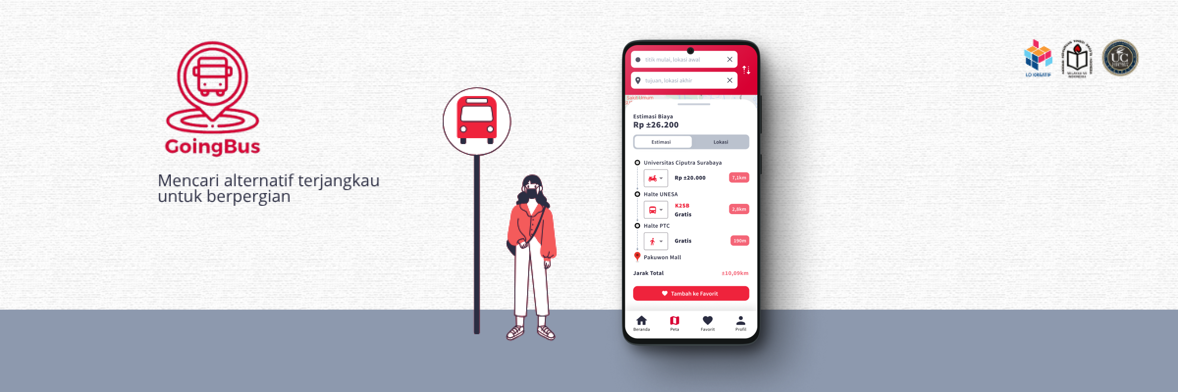
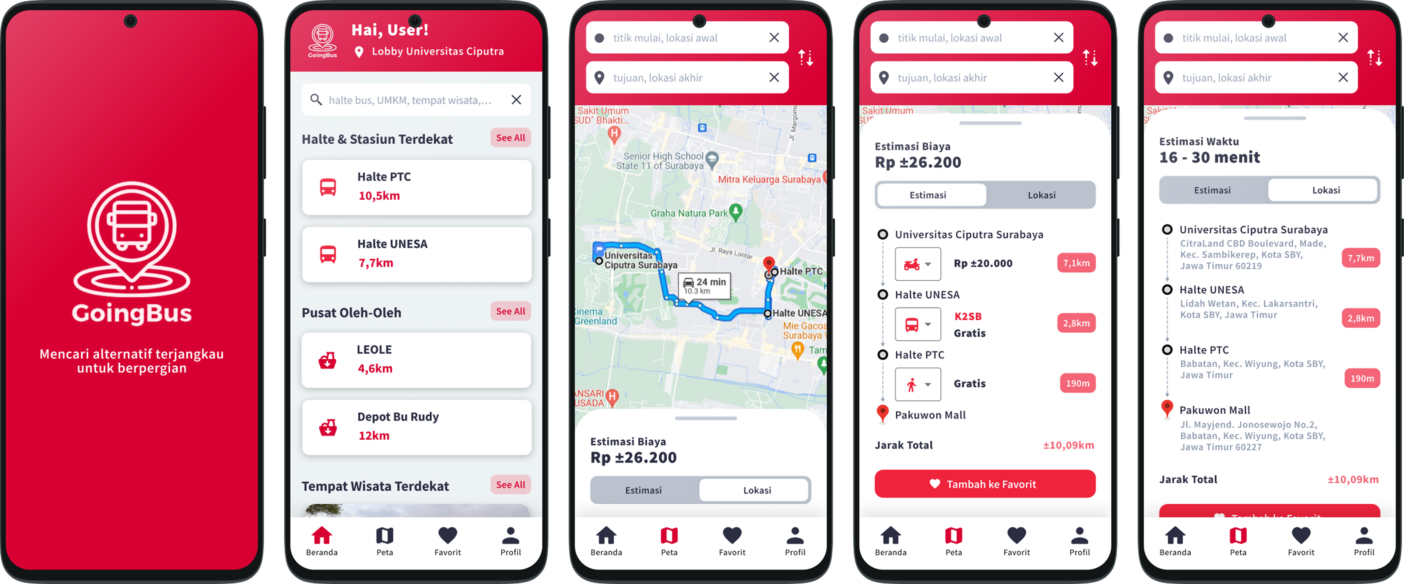
GoingBus reimagines the daily commute as a guided, multi-step journey. It automatically
generates connected routes that combine cars, buses, trains, and walking segments—each with
transparent cost and time estimates.
The app’s interface emphasizes clarity and logical sequencing, displaying each leg of
the journey as a visual timeline. Users can see their route at a glance, compare options, and even
save favorite plans for future trips.
By prioritizing structure and readability, GoingBus transforms what used to be a chaotic
planning process into a calm, predictable experience.
Users can input a starting point and destination, then view step-by-step route
suggestions complete with estimated costs, travel times, and total distances. Each route displays
the transitions between modes (for example, car → bus → train → walk), allowing users to choose the
most practical or economical path.
Design Process
The process began with the given theme—transportation—and the freedom to identify a
specific problem within it. After research, the focus narrowed to helping locals plan connected
routes easily.
- Problem Definition: Identified the difficulty of managing multi-modal trips.
- Ideation: Listed possible solutions, focusing on automation, cost estimation,
and usability.
- Flow Planning: Outlined the user journey from “search route” → “view results” →
“save route.”
- Design & Brand Direction: Selected the color palette and typography to
reinforce clarity and trust.
- Prototyping: Designed each screen following the flow, emphasizing quick
understanding and minimal visual clutter.
The app’s logic was built to support layered information—starting from the overall trip
summary and expanding into detailed segments—ensuring users always have the right amount of context.
Visual Direction
The color palette combines #D80032 (crimson red) and #2B2D42 (dark slate), balanced with
#FFFFFF(white) and #EDF2F4(light gray) for contrast and readability.
- #D80032 Crimson red acts as the highlight color, guiding attention to important
actions or selected routes.
- #2B2D42 Dark slate provides a strong, trustworthy foundation.
The combination conveys energy, reliability, and movement, reflecting both the dynamic
nature of travel and the app’s goal to simplify it. The interface uses generous spacing, clear
typography, and step-based visuals to maintain a feeling of flow and order.
The Outcome
GoingBus successfully delivers a unified multi-transport planning experience.
Key features implemented:
- Smart multi-step route generation (car, bus, train, walk)
- Time, cost, and distance estimations for each leg and total journey
- Route timeline view with mode indicators
- Save favorite routes for reuse
- Clean, easy-to-read summaries for decision-making
The final product feels intuitive and efficient, helping users plan smarter and travel
with confidence. GoingBus stands out as a thoughtful navigation companion for local commuters who
value clarity and control over their journeys.
Learning & Reflections
GoingBus reinforced the importance of translating complexity into simplicity. Designing
for multi-modal travel required balancing detailed data with a user-friendly interface—a reminder
that good design should never feel heavy, even when handling rich information.
Through this project, I learned how to structure content hierarchically, ensuring that
users can dive deeper when they want to, but never feel lost in the process. It also highlighted the
value of clear visual language and color communication in guiding users through complex flows.
Ultimately, GoingBus taught me that when design bridges logic and empathy, even
something as intricate as route planning can become effortless.