The Challenge
Many people struggle to keep track of where their money goes after shopping or eating out,
especially when small purchases accumulate without notice.
Existing expense tracker apps often feel too complicated or cluttered, requiring
multiple steps just to record a single item.
The challenge was to design a tool that makes expense logging effortless and intuitive, encouraging
users to stay consistent with tracking their spending without feeling overwhelmed.
The Solution
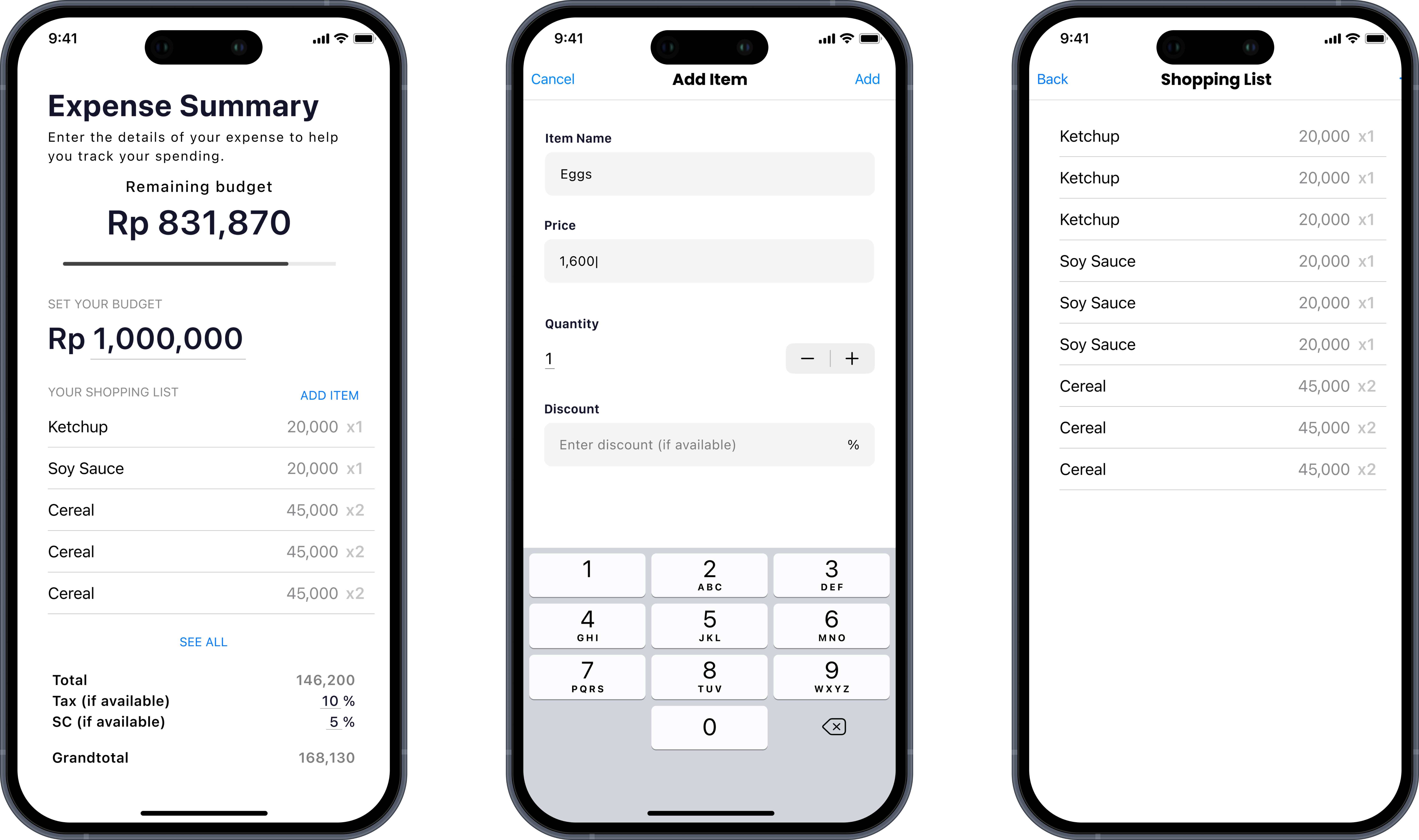
Shopper delivers a clean and focused budgeting experience tailored for everyday users.
It emphasizes clarity over clutter—allowing users to instantly see how much they’ve spent, how much
remains, and how their purchases add up.
Every interaction feels effortless: entering expenses, viewing totals, and managing
lists can all be done with minimal taps. The design prioritizes readability, hierarchy, and flow,
creating a smooth budgeting process that feels natural even for first-time users.
The app enables users to:
- Set and monitor a spending budget
- Add and view shopping items with detailed pricing and quantity
- Automatically calculate totals, tax, and service charges
- Display a real-time remaining budget
Design Process
The design process began by identifying the core pain point: many expense-tracking apps
felt cluttered, overly complex, or required too many steps for basic budgeting. The goal was to
create a simplified and intuitive interface where users could focus purely on
managing their daily spending without distractions.
I started by mapping out the main user flow — from adding an expense to viewing
the remaining budget — ensuring each step felt natural and required minimal effort.
Early wireframes explored various ways to display spending summaries while keeping visual noise low.
After several iterations, I refined the layout into a card-based structure with clear hierarchy and
spacing to enhance readability.
Accessibility and visual balance were key considerations throughout the process. The
grayscale color system not only reduced visual strain but also allowed the native iOS blue
accent to stand out clearly for key actions such as adding new expenses or confirming
entries. Usability testing with peers highlighted the importance of immediate feedback, which led to
subtle motion and color transitions to guide attention smoothly between screens.
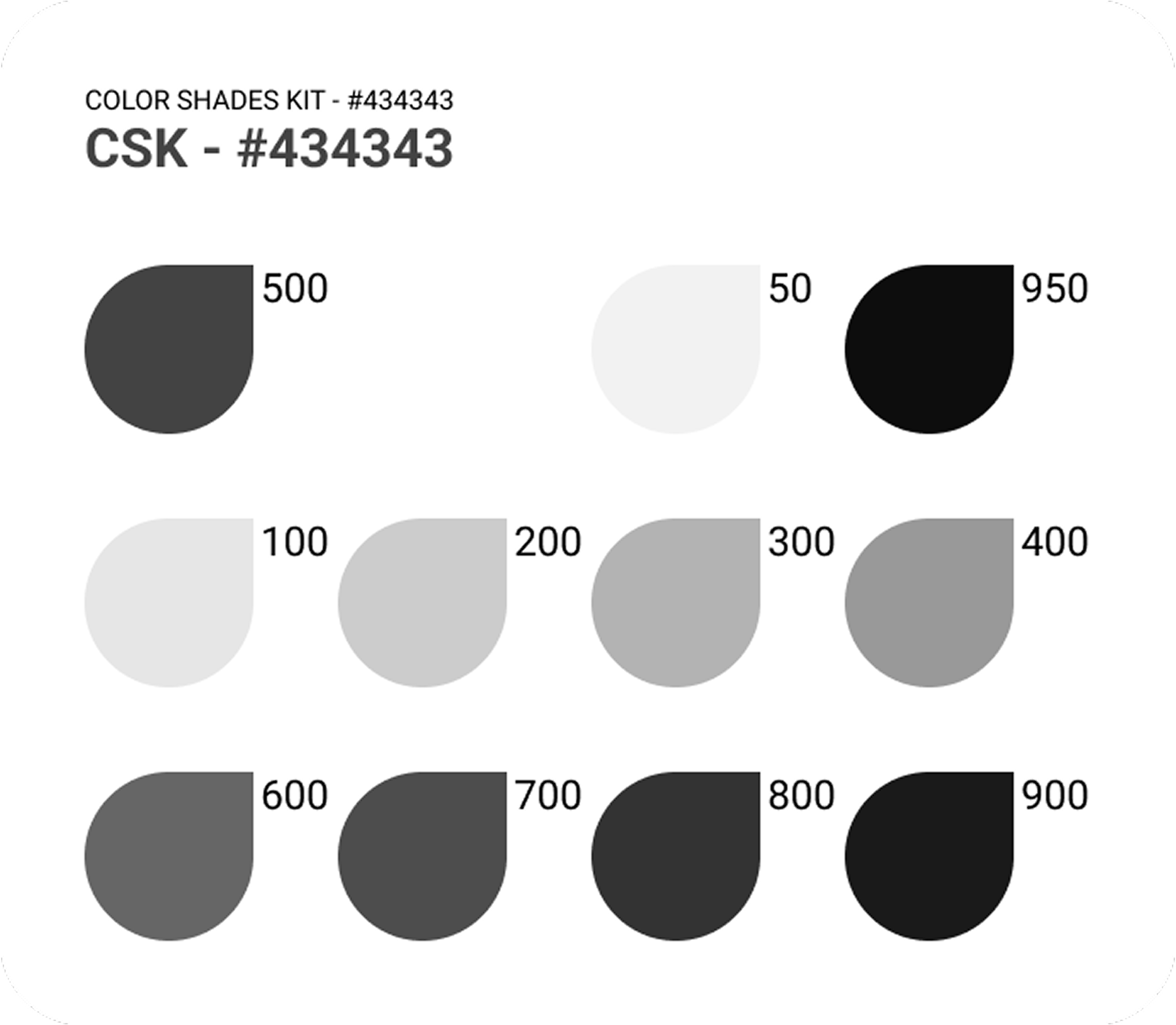
Visual Direction
The visual direction of Shopper centers on clarity, calmness, and
efficiency. The neutral grayscale palette (anchored by #434343) creates a
modern and minimal atmosphere that emphasizes content rather than decoration. Each tone in
the palette serves a distinct role—from light backgrounds that maintain openness to darker
shades that establish contrast and depth.
The native iOS blue acts as the primary accent color, used
sparingly to signal interactivity in text buttons, icons, and progress indicators. This
color pairing gives the interface a professional yet approachable look consistent with iOS
conventions.
Typography follows Apple’s SF Pro system font for a cohesive iOS
experience. Its clean geometry and versatile weights enhance hierarchy, ensuring numbers, totals,
and buttons remain legible at all sizes. Generous padding, rounded corners, and smooth transitions
further reinforce the app’s sense of simplicity and trustworthiness.
Overall, the design direction aims to create a budgeting app that feels
effortless, elegant, and naturally integrated into the iOS ecosystem — where users
can focus on their finances without visual clutter or friction.
The Outcome
Shopper successfully delivers a simple yet efficient expense tracking
experience that lowers the barrier to financial awareness. Users can manage their spending in
seconds instead of minutes, making budget tracking a natural part of daily life.
Learning & Reflections
Working on Shopper reinforced my belief that simplicity is a skill, not a
limitation. Designing for clarity requires precision — every element must earn its
place. Working solo on the project deepened my understanding of how usability and minimalism
can enhance habit-forming behaviors in productivity apps.
Key lessons include:
- Designing around user motivation instead of only features
- Balancing aesthetic clarity and practicality
- Translating design intent into functional SwiftUI components
I learned how to focus on core functionality without over-designing, ensuring that
visual hierarchy and user logic remain intuitive. This project also deepened my appreciation for
structuring information visually, allowing users to understand their spending at a glance.
In the end, Shopper became a reminder that great design often means knowing what
to leave out — and letting simplicity speak for itself. It reaffirmed that reducing
friction in everyday tools is what truly makes an experience enjoyable and sustainable — proving
that effective financial management starts with design people love to use.